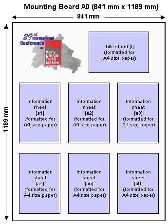
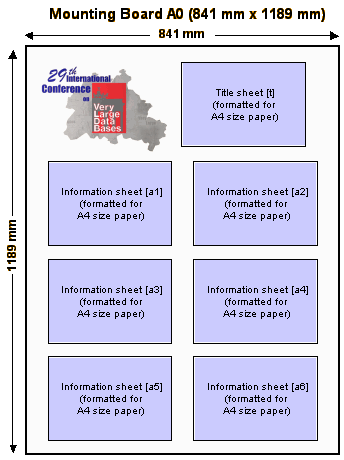
| There
are two types of sheets in a poster:
The
title sheet [t] includes the poster title, the name and
affiliation of the author, and, optionally, the name of the supervisor.
The title sheet has the following parts: 1.1.
The title in at least 24 pt (36 pt or 48 pt is better) upper-case
and lower-case letters.
1.2.
The author's name and affiliation (organization name only please)
below the title in at least 18 pt (24 pt or 30 pt is better) upper-case
and lower-case letters.
1.3.
Optionally, the supervisor's name, in the format "Supervisor:
name", below the author's name in 18 pt upper-case and lower-case
letters.
You should use a large enough font size to be easy visible from
several meters (feet) away and that will draw people to view your
poster. Use all of the space on the title sheet effectively; avoid
leaving too much empty space.
The information sheets [a1, a2, a3, a4, a5, a6] contain
the content of the poster. Note that you do not need to
use 6 sheets, but that is the maximum number of content
sheets you are allowed. You should design your information layout
according to the following guidelines: 2.1.
The introductory paragraphs should be in a larger typeface than
you use in a detailed descriptive section. The typeface should
be readable at a distance of two to three meters (while the smallest
type you use may be readable at a distance of only one meter).
Generally speaking, keep in mind that the larger and bolder your
presentation, the more enticing it will be to the people seeing
it at a distance. The real challenge then, after you have attracted
attention to your poster, is to provide enough interesting and
readable detail for someone who wants to learn more. One compromise
might be to have some parts that are packed with useful information
and are typeset in a smaller font. Don't forget, however, that
important results should be big enough for reading at a reasonable
distance!
2.2.
You should try to use paragraphs with centered titles, such as
"Overview", and "Methodology" in at least
18 pt upper-case and lower-case boldface letters.
2.3.
Make effective use of titles for paragraphs, figures and other
material. Use a typeface that is readable at two to three meters
(boldface helps) for the major part of the titles (for visibility)
and regular type for details.
2.4.
A multicolumn format usually improves readability by reducing
line length and allowing for more text structuring.
2.5.
Color should be used to effectively communicate what you want
to present (e.g., for emphasis, in graphs and other graphics).
2.6.
Figures (including diagrams, charts, graphs and schematics) are
a good way to communicate interesting ideas.
Remember:
posters are supposed to be interactive. You will be there
to explain the details. Your poster should only convey the most
relevant points not all the fine detail of your research.
|